User Experience Professional

Project Scope
Role: UX Designer
Client: a class project
Project Type: desktop website redesign
Project Length: 2 weeks
My Contribution: User Research, Persona, Usability Test, User Flow, Site Map, Sketches, Wireframing, Prototype Testing, Medium- to High-Fidelity Mockups
Tools: Pen & Paper, Miro, Optimal Workshop, Figma, Google Workspace
Books Inc.
Redesign
General Assembly
Founded in 1851, Books Inc. is the oldest bookstore in the West. The medium-sized business operates ten locations in the San Francisco Bay Area in Northern California and maintains an e-commerce site.
Assigned to update a local e-commerce site, I need evidence-based direction to design a user-friendly site and checkout experience.
Goal: Conduct user research to clarify and address usability issues, synthesize findings, and redesign Books Inc.'s website.
Results: Shoppers felt that they had a better understanding of how to use the redesigned site's limited search functionality. Users reported they could navigate the site with fewer clicks and scrolls while quickly consuming relevant information about purchases.
Next Steps: Test the results of an open card sort to see if shoppers find the site's global navigation more succinct and easier to browse for titles. Discovery was the second most popular method users found new titles.
THE PROBLEM
The current website suffers from several usability issues
Three (3) volunteers agreed to conduct a usability test of the current site. The test articulated the following:
1. Add a young adult fantasy book to your cart;
2. Add a bestseller to your cart; and
3. Check out, specifying that you want to pick up the order at the Campbell Books Inc. location.
Users expressed that the site is challenging to navigate, in particular: limited search functionality frustrated all testers, and some design patterns overwhelmed users rather than helped them. Finally, there was the opportunity to try different design patterns to improve site usability and scannability.
Homepage, Product Grid Page, Product Detail Page, and Checkout Page


THE USERS
Addressing different user needs
Simultaneously, I conducted three (3) user interviews to introduce myself to independent bookstore customers' needs, habits, and pain points. Upon synthesizing the customer research in an affinity map, I could identify two distinct customers:

Ellie, the browser, may spend fifteen minutes reading book descriptions. Or, she uses title or author searches, then scrolls through pages of results until something catches her eye. "It's not an efficient method."

Mel, the seeker, may not consider himself knowledgeable about authors or the "best books," so he's likely to select a book from an author recommended by someone he trusts. However, searching for a powerful lesson from the right author is imperative when shopping for his young son.
For this study, we will focus on helping Mel find a quick and easy way to search and discover the next title by his young son's favorite author so that the father can encourage the son's good reading habits.
How might we better communicate Books Inc.'s limited search capabilities so Mel can find the latest book by his son's favorite author?
USER WORKFLOW
Optimizing for search
Next, I worked on the user workflow for Mel to diagram his entire book-buying experience and avoid missing any crucial details. Doing so helped me prioritize which screens are relevant to searching for a specific title or author instead of browsing, a far more complex flow.

WIREFRAMES
Ideating through sketching
I sketched wireframes to visualize Mel's book-buying experience with an emphasis on clarifying the site's capabilities. Below are a couple of wireframes.
Home and Product Detail Wireframes


Then I moved to digital wireframes. At this stage, I aimed to improve clarity and reduce clutter.
Product Grid, Product Detail, Cart Review pages


DESIGN
Solving (limited) search
I prioritized search because that reflects the usability testers' -- and thus Mel's -- first instincts. Adding a shortcut dropdown menu to Books Inc.'s search bar, articulating the type of queries Mel can enter, may better signal the site's limited search capabilities to users.

When patterns become obstacles
Books Inc. uses row upon row of expandable accordions to condense the numerous check-out text fields -- a feature many users responded to negatively. I divided user data fields into separate pages for shipping address, billing information, and review to unburden Mel.

Organizing info beyond containers
Although everyone appreciated the information's availability within the containers, users found the volume of text and layout overwhelming. A solution that tested well sorted the product information into columns: publisher and indexing information on the left third of the screen; book description and reviews share the remaining two-thirds of the screen but remain separated by tabs. In addition, in-store stock data is a dropdown menu rather than yet another container.

TESTING
Even the best-laid plans...
Three volunteers confirmed that they would test my prototype at medium fidelity. The test set the goal that users should be able to search for and purchase a book title in less than three minutes with no more than four errors.
The test consisted of three tasks:
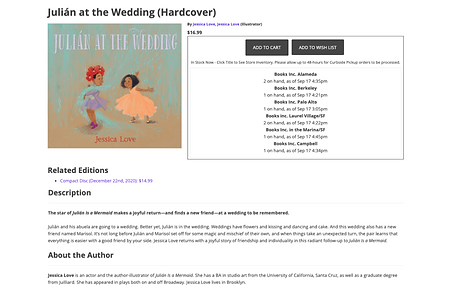
1. Find book title by author Jessica Love.
2. Verify the publication date of Julián at the Wedding.
3. Complete a purchase of Julián at the Wedding.
Then my plan fell apart. Two of the volunteers canceled their sessions, and due to the extended time I took prototyping, I could not schedule replacements. Moreover, I did not effectively allocate time for users to test iterations of my high-fidelity prototype.
Nevertheless, I feel I captured good data and feedback from the one volunteer who tested my prototype. For example, I learned the value of an e-mail confirmation note on the order confirmation page. Also, on the product grid page, the user suggested I include missing conventions like a sort options dropdown menu and buttons for pages of results and navigation.
PROTOTYPE
Try it for yourself!
Follow along with Mel as he searches for the next book by his young son’s favorite author, Jessica Love. Click the image below to view the interactive prototype!

"The dropdown menu is one of the first things I noticed with it in front of the search bar... So, I knew I would be able to make different choices there, which was helpful."
Of the redesigned product page: "I like the setup. Real quick, I can peek at the information without having to click through anything."
NEXT STEPS
Card Sort and Site Map
To relieve the confusion caused by the current navigation options during the usability test, I generated an open card sort for users to organize elements of Books Inc. into more intuitive categories. Using these findings, I created a site map that eliminates the site's secondary navigation, making the global navigation more succinct.

If I had more time with the project, I would like to test how users respond to the new site map, especially as there is a greater emphasis on the visitors' ability to browse for titles. Browsing -- and therefore, discovery -- was the second most popular form of finding new titles interviewees mentioned and a common feature observed while doing competitive and comparative analysis.
REFLECTIONS
You live, and you learn.
Redesigning Books Inc.'s website was my second solo UX project, and I learned quite a bit about myself and the UX process completing the sprint.
• Creating a project schedule can help improve time management such that I allocate enough time to each phase of the process, and I avoid scrambling when things do not go according to plan.
• My abilities as a researcher far outshine my UI/interaction designer skill -- though I am still learning both. I look forward to improving as I continue to take on UX projects.
• Aligning business objectives with user expectations via empathetic research is surprisingly satisfying. And I am proud of how well I grasped users' feedback and translated them into actionable design suggestions.
Thank you for reading!